Northumbria University illustration students drawn to charity's push to raise £40,000 for survivors of abuse
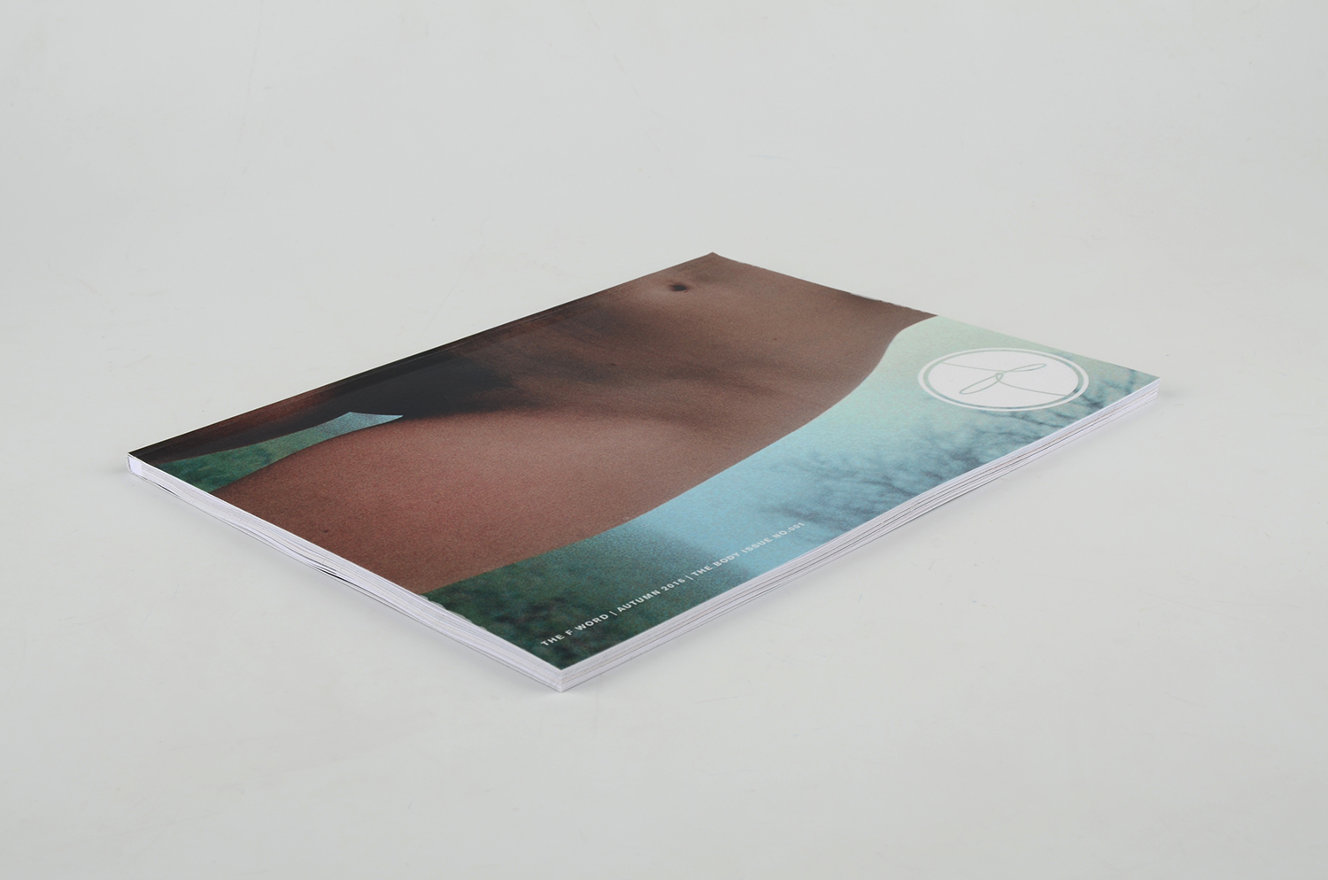
In September 2017, Rape Crisis Tyneside and Northumberland (RCTN), in collaboration with the illustration pathway on BA(Hons) Graphic Design degree at Northumbria University, challenged 2nd year illustration students to come up with designs for new saleable merchandise to help the North-East charity towards its ambitious target of raising £40,000 in its 40th anniversary year.
 RCTN set the illustration students three key words to interpret into the merchandise; three important words that most women use to describe how RCTN makes them feel after their counselling… HOPE, SOLIDARITY, and LIBERATION.
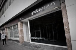
The exhibition of work by the students opened on Friday 12 October at the Globe Gallery on Pilgrim Street, Newcastle, running until Monday 22 October, with an evening reception on Thursday 18 October between 5pm and 8pm that is open to the general public.
The students each chose a merchandise category from the list of
Greetings cards, postcards, stationery sets, art prints
T-shirts, scarves, tote bags
Ceramics, cups, plates, mugs
and then they each created six illustrations. In the exhibition, each illustrator has at least two of those illustrations displayed. Each framed illustration is for sale with the student donating 33% of its sale to RCTN, but 100% of the proceeds from the merchandise will go to the charity.
The illustration students exhibiting in this exhibition are:
* Josh Aitken
* Hung-Ling Chen
* Asa Hindarto
* Flora Marriott
* Sarah Montgomery
* Kyle Mooney
* Calum Scott
Josh Aitken’s illustrations were chosen by RCTN to go forward as the design for all the merchandise and will be available to purchase from Globe Gallery,
Rape Crisis Tyneside and Northumberland opened on 17 November 1978, making it one of the oldest Rape Crisis centres in England and Wales.
Initially known as Tyneside Rape Crisis; the charity expanded over the years and now offers services not only in Newcastle but also in Northumberland, where it is known as Grace Rape Crisis Centre.
Rape Crisis centres are women-led and offer a range of support, advocacy, counselling and information in a women-only safe space. Some also provide separate spaces and services for male sexual violence survivors and/or for men who are supporting a survivor.
Website: https://rctn.org.uk
Twitter: https://twitter.com/RapeCrisisTN
Facebook:https://www.facebook.com/rape.crisis.tyneside.northumberland/
Instagram: https://www.instagram.com/rape_crisis_tn/

Quark Teams up with Fontsmith to Provide £1240 Worth of Fonts for Free
Special Bundle Offer – Buy or Upgrade to QuarkXPress 2018 Now and Get 12 Professional Fontsmith Typefaces (includes 56 individual fonts plus 200 icons) Worth More Than £1240 FREE!
Quark Software announced today a new software bundle offer that will save designers £1240* when buying or upgrading to QuarkXPress 2018. The bundle offer allows users with any version of QuarkXPress to receive a set of 12 professional Fontsmith typefaces encompassing 56 individual fonts plus 200 icons, completely free when they upgrade to QuarkXPress 2018 or purchase a new license.
QuarkXPress 2018 is the latest version of the professional graphic design software that includes industry-first features that boost productivity, support modern font requirements, and advance print and digital publishing. New features include full colour font support, first-class OpenType controls, hyphenation strictness levels, direct InDesign IDML import, built-in JavaScript support, unlimited Android and IOS app creation and more. According to customers, QuarkXPress is the best choice in professional design and layout software.
Fontsmith’s Professional OpenType Fonts
Fontsmith is a leading and established boutique type foundry known for creating fonts that are distinctively human and full of character. Founded in 1997 by Jason Smith, Fontsmith today represents a truly international team of designers working from a London studio. The Fontsmith library includes an extensive collection of typefaces – elegant and traditional, contemporary and quirky – suitable for a range of applications. In addition, the team design and create bespoke typefaces for global brands including ING Bank, British Gas, Jaguar, ITV, Renault, Sainsbury’s, Sky News, Telefónica Movistar, UEFA Champions League, Colgate, and Xerox.
Pricing and Availability
The new Fontsmith bundle is available until 30 November 2018 with the purchase of every new full version of QuarkXPress (£725), upgrade (£159 from version 2017; £349 from versions 3 to 2016) or Competitive Upgrade (£349 from InDesign, CorelDraw, Microsoft Publisher and Photoshop users).
The offer is also valid on the purchase of non-profit (£149) and single education licenses (£69) of QuarkXPress 2018. To find out more about the offer, restrictions and how to redeem the free fonts please visit: http://content.quark.com/fontsmith-bundle-en.html.
For Just £349 Switch from InDesign to QuarkXPress and Get Fonts Worth over £1240
Attention InDesign, CorelDraw, Microsoft Publisher and Photoshop users: Anyone who owns software that competes with QuarkXPress is eligible to purchase a full new, perpetual and upgradeable QuarkXPress 2018 license for just £349 instead of £725. Customers who purchase the Competitive Upgrade will also receive the free Fontsmith typefaces as part of the font bundle promotion. Find out more about the competitive upgrade offer.
QuarkXPress 2018 is available for purchase through the Quark Store, from our Quark telesales team or from any of our Authorised Resellers.
Learn more about QuarkXPress 2018: http://www.quark.com/Products/QuarkXPress/.
*Original SRP in GBP prices shown as USD or EUR are approximate price values based on the actual currency exchange rate and are excluding VAT.

The Customer is Always Right, Right?
We’ve all heard the phrase “the customer is always right”, and in most cases it’s very true. Short of the customer jumping up on the shop counter and screaming in your face, you’ve pretty much got to fulfil their every desire – regardless of how unreasonable that desire may be.
In design, it’s a bit different.
Now, don’t get me wrong, we always have to respect the client’s opinion. But, unlike retail and similar customer-facing professions, we don’t always have to agree.
Imagine you worked in a clothes shop. A customer is trying on an outfit, and they think they look absolutely fantastic. The customer then gleefully asks for your opinion and, while the voice in your head is saying “take it off and burn it immediately”, you would always agree with them and tell them they look great.
Now imagine you’re sat in the design studio with a client, and they’re looking over the designs for the business cards you just spent the day designing. In this particular composition you’ve followed the brand guidelines and positioned their company logo in the top right of the card -modestly sized, leaving just the right amount of empty space.
Immediately, the client’s reaction is to have you ‘blow up‘ the logo to fill all of that ‘blank space‘. That voice in your head returns, exclaiming unfiltered rage at the client’s lack of understanding of design and their own brand guidelines. Unlike the customer in the shop, you don’t necessarily have to agree with this opinion.
This would be one of those moments where you need to employ the art of selling your idea with tact. As a designer it’s not just your job to create good design, your job is also to champion your own idea – and this sometimes means politely challenging your client’s opinion and trying to sway them to your point of view.

Deadlines or Daydreams: When Do Designers Get the Most Done?
So I'm sure no matter how long you've been in the field you've been faced with both sides of this coin; the free reign concept with plenty of time and resources vs the project that the client wants yesterday while everyone else is nowhere to be seen.
Looking at it now I'm sure 95% of us would hands down say the first is by far the most preferable option, but when you're actually there just twiddling your thumbs scrolling through pages of stock (and probably cute cat) images wishing the time away, is it really? Take a second to look back at the last time you were on a really thin thread with a deadline, did you get it done? Exactly. Whilst it might not be true for everyone, a lot of people, myself included, work far better when we don't have time to spare.
Most of you are probably reading this thinking well obviously, because if we didn't handle pressure then we wouldn't get anywhere, am I wrong? Whilst you are right in thinking that, there is actually some science behind this. It's said that when a reward (in this case, a finished project) is further away we tend to lessen its value which is also known as hyperbolic discounting which makes perfect sense because if something isn't imminent then we focus less of our effort and attention on it. Another reason that we do this is due to us having a tendency to think of our past and future selves in the third person, for example have you ever been drunk and ordered "future you" a pizza for the next day to cure the hangover? (No me neither, but I'm sure some smart ass on the internet has). I digress but it's true, if you think that there's something you can put off for your future self to do, we both know you're going to do it.
Now as someone who coasted through college seeing how much partying (I mean gaming, c'mon I was no Steve Stiffler) I could squeeze in before actually grabbing my laptop and stash of redbull and cracking out 6 week projects in 24 hours. I can completely vouch for this. Unfortunately when it comes to work, things aren't that easy and we are faced with much higher pressure on a much more frequent level.
As I said, while its true that loads of us strive under pressure, we all know that the productivity spike during chaos is much more useful with some organisation and planning. So for those likeminded folks who could do with just a little more method to the madness, if you aren't already familiar with it then I highly recommend having a read of something known as the broken window theory. A mid 1900's criminology theory that in its essence translates that by going through all the small problems and hiccups with your workflow you will in turn eliminate more of the large ones before they even occur giving you a clearer view of how to proceed.

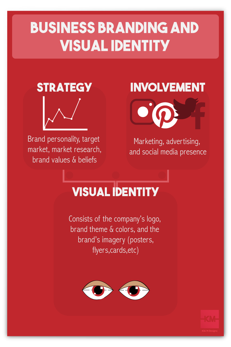
Business Branding and Visual Identity
Whether you’re a designer, business owner, or brand the most important part of building your reputation is branding your company. It may seem like a long, tedious task but it’ll make running your business a lot smoother. Think about it as another aspect of your business that contributes to its success and organization. It’ll help you or your client’s business get the word out there by making sure it’s well represented and targeting the right audience. A business’ brand consists of their Brand Involvement, Strategy, and Visual Identity. Now, let’s break this down.
The Brand Involvement just refers to where the brand is planning on getting involved. This is via social media, advertising, etc. With this the business must look at their target market and plan accordingly. This involves a lot of marketing skills and patience. A business’ strategy consists of the personality, target market, and the brand’s values and beliefs. When a business creates a business plan this is what a lot of the research that is done will help you with. A company’s target market as well as personality and values will contribute greatly to their visual identity. As a graphic designer it’s part of our job to look at their strategy and come up with an appropriate visual representation of their company.
Visual Identity
When we talk about a business’ visual identity its referring to their logo, brand colors & fonts, and the brand’s imagery. Some people don’t believe that a company’s visual identity is important. It really is and I could not stress that enough. They say, “don’t judge a book by its cover” but that is exactly what people do when they’re looking at your business. When someone goes out and buys their pets food, they aren’t going to go to a company that’s visual identity is straight up ugly or dated. Maybe in some situations this will help out the business more than hinder it but in most cases people want to go somewhere that looks professional, neat, clean, and up to date. Yes, trends play a HUGE role in keeping your business afloat, but that’s a whole different conversation. The reason visual identity is so important is because it’s how customers identify or remember a business; everything down to the colors and fonts used. usually and icon or lettering that represents your company as a whole.
This is where the company’s strategy helps with the visual identity. You often want to look at your target market, mood, and personality. You also want to look at what the company does, of course. When looking at all of these things you want to make sure that whatever logo your business decides to go with, or if your designing a company a logo, that its appropriate within the parameters given. For example, you don’t want to create a logo for a pet store that’s a multi-color butterfly. Simply because it doesn’t scream, “pet store”. Something along the lines of a collar or a feeding bowl would be more appropriate. You also want to make sure that your logo is simple, clean, and to the point. Simple logos are never a bad thing. In fact, I believe a simple logo is the best way for a business to create their logo.
Now, for some businesses, a complex logo suits their brand. That call is completely up to the business owners but, let me explain why simple is better. Firstly, it’ll be easier for people to remember what business the logo belongs to. If its simple then its easy to remember. Secondly, if you over complicate your logo, it could end up looking like a complete mess or, nothing like your original idea. And lastly, it almost always guarantees that the logo will be universal when it comes to web, print, and manufacturing copies of the logo; meaning it’ll look good no matter what. You want to stand out from your competitors. Your logo should also be distinctive and in correspondence with your brand’s colors and themes.
Speaking of brand colors and themes… This is another big aspect to a business’ visual identity. This refers to the company’s color scheme, fonts, layouts, etc. Again, these should be appropriate. These often reflect the business’ “mood”. When it comes to color it’s recommended to do some color research as well as create a mood board. A mood board is simply a document that is comprised of images from the internet that go along with the mood you’re trying to set with your brand. The most effective way to gather these images is creating a private Pinterest board and pinning things that match the mood the business is going for. If you’re a designer working with a client you can still create private boards, invite them to it, and ask them to pin things that match the mood they’re aiming for. This is often where you will get your colors as well as font ideas. With color being one of the more important things when branding, it’s a really good idea to do some research. Every color sparks different emotions and can often give people incentive to buy from you or even to avoid your business. There have been many studies that look into how color affects mood and actions. It’s actually pretty neat. Information on this can be found on the Internet. There is just so much to say about color; it’s almost better to just go out there and research it on your free time.
As a graphic design artist it’s crucial to know what colors do what especially when a client is asking you to assist them in their decision making. Lastly, a company’s visual identity includes any and all of the brand’s imagery. This refers to any product packaging, stationary, business cards, posters, flyers, marketing materials, and just any visual representation of the company or business. When creating brand imagery it often corresponds with the brand’s themes and logo. This is the most straightforward area of branding. Once you find a layout that works it should be universal for all of the brand’s imagery. You often see the same design on a business card as the letterheads, pencils, envelopes, etc. Like mentioned before you want your business’ brand to be neat, clean, and to the point. In this case repetition is the recommendation. You want everything to work together so when people see it, they think of your business.
There is so much information that can be told about branding. As an artist or as a business owner, it’s really about the experience. The Internet will be your best friend. Always remember to keep it clean, simple, and to the point.
An Interview with Kara Clifford
We interviewed self-proclaimed feminist and graphic designer Kara Clifford from Huddersfield, UK.
Tell us a bit about yourself, where did you study?
I have just finished 6 years of studying graphic design. I first found my love for design and in particular editorial design whilst studying an Extended Diploma in art and design at Leeds College of Art. Afterwards I did a BA (hons) degree at The University of Huddersfield, where I was then offered a scholarship to complete a Masters degree in graphic design. I have been interested in design all my life, without really noticing. When I was younger, I used to rip pages or elements that I liked out of magazines and stick them all over my wall. I get my inspirations from everything around me, and I believe that working alongside people from different courses such as fashion and textiles students on my MA degree has definitely made me a stronger designer.
“I had noticed a rise in people talking about feminism on social media. I wanted answers for why women or men felt that they couldn't admit to being a feminist, when the dictionary definition is 'equality of the sexes.'”
What came first, your interest in feminism or design?
Definitely design. Up until last year I didn't even call myself a feminist. I was pretty ignorant to it, which I have found that a large majority of people are. There is a pretty awful stereotype of what a feminist is. Some people instantly hear the word 'feminism' and think of mad women running around burning bras and hating men. I remember even on my MA degree I had male tutors asking me 'Oh you're doing your project on feminism, are you a feminist then?' and me being hesitant on saying yes. This was literally because I didn't want people to think that I fit into that false stereotype of what a feminist is.