Typography & Truth
The New York Times ran an experiment which concluded that typography can influence our perception of the truth. For instance, if we read a fact that was written out in the dreaded Comic Sans, we'd perhaps view that fact differently than if it were written in a more aesthetically pleasing font like Helvetica.
For the uninitiated among you, a font is an assortment of type that shares a style and size and a typeface is the style or design of the font (i.e. bold, italic etc). Serif fonts such as Times New Roman and Garamond have small lines at the ends of character strokes. They're commonly used in books and newspapers, due to their high readability on paper.
Sans serif fonts are a category of typefaces that do not use serifs. Various studies have come to the conclusion that sans serif fonts are more difficult to read on paper. That's why in print they are seen more often as headlines and captions.
Looking past the physical properties of these typefaces, there is also the cultural significance. What does the font you choose say about you or your business, and what impact might it have? Serif fonts are associated with academia and authority, which may be important to you if you're looking to instil feelings of trust in your reader. Or, if you want to align yourself or your brand with youth and modernity, a sans serif font would be the way to go.
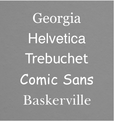
In the New York Times experiment, readers were shown a statement written in one of five fonts: Georgia, Helvetica, Trebuchet, Comic Sans and Baskerville. Interestingly, more people believed the statement when it was written in Baskerville – a serif font – than the other four typefaces.
So, does the font you use really matter? If the New York Times is to be believed, then the answer is yes.
Your font choice could really affect people's perception of you and your services - it may hold the power to make people choose your service over the competition, upgrade to a higher ticket product or even pay the premium rates you've always wanted to charge...


